 Editorify
How to switch to the Modern review design
The new design for the reviews on your product pages, and how to preview it before you switch.
On this page
Editorify has two designs for the reviews section on your product pages: Modern, the new design, and Classic, the design stores have used until now. You choose one in the Editorify dashboard under Display Settings > Design, and you can switch back at any time. Your store keeps Classic until you switch. This guide shows each part of the Modern design, what changed, and how to switch.
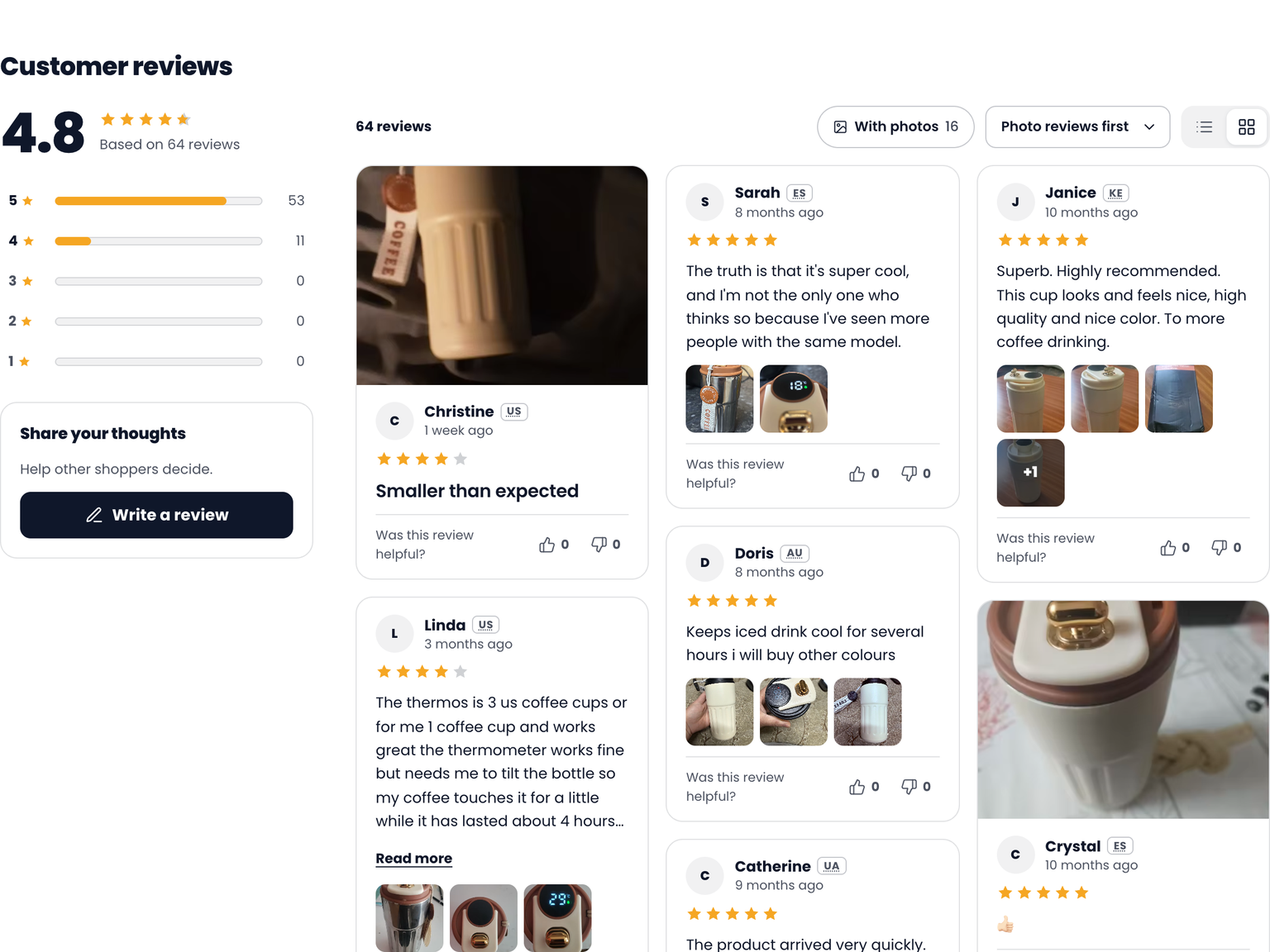
How to switch to Modern
Log in to the Editorify dashboard.
Open Display Settings.
In the Design section, click Modern. The preview on the right shows the Modern design with your colours and font. Your store does not change yet.
Click Switch to Modern. The Modern card now says In use.
Open a product page on your store and refresh it to see the new design.
To go back, click Classic and then Switch to Classic. Your reviews, photos and settings stay the same either way.
Preview Modern on your own store first
You can see the Modern design on your real product pages before you switch. Open any product page on your store and add ?efy_template=modern to the end of the address, for example:
https://yourstore.com/products/your-product?efy_template=modern
If the address already has a ? in it, add &efy_template=modern instead. Only you see the preview. Your shoppers keep seeing your current design until you click Switch to Modern.
Rating summary
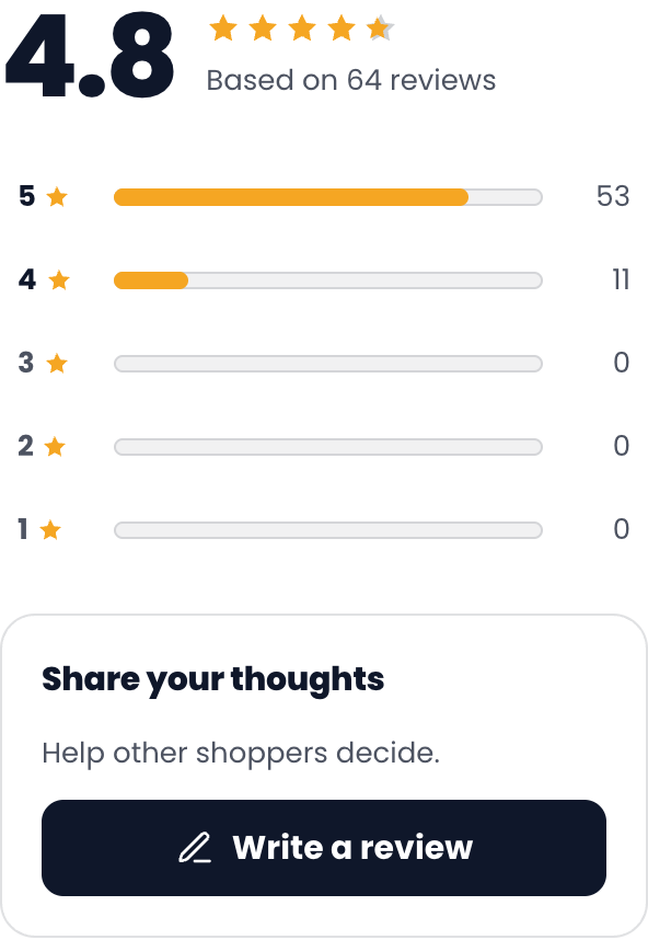
Average and stars. The average rating in large numbers, with stars that fill in part of a star for averages like 4.8, and how many reviews it is based on.
A row for each rating. Each row shows how many reviews have that many stars, as a number instead of a percentage, so the rows always add up to your total.
Share your thoughts. A box with the Write a review button. It only shows when the Write a Review button is turned on in Display Settings.
Filter by rating
The rating rows double as filters. Tap a row to show only those reviews. The bar above the reviews says what is shown and has a Clear link. Tap the row again or click Clear to see all reviews. Ratings with no reviews can’t be tapped.
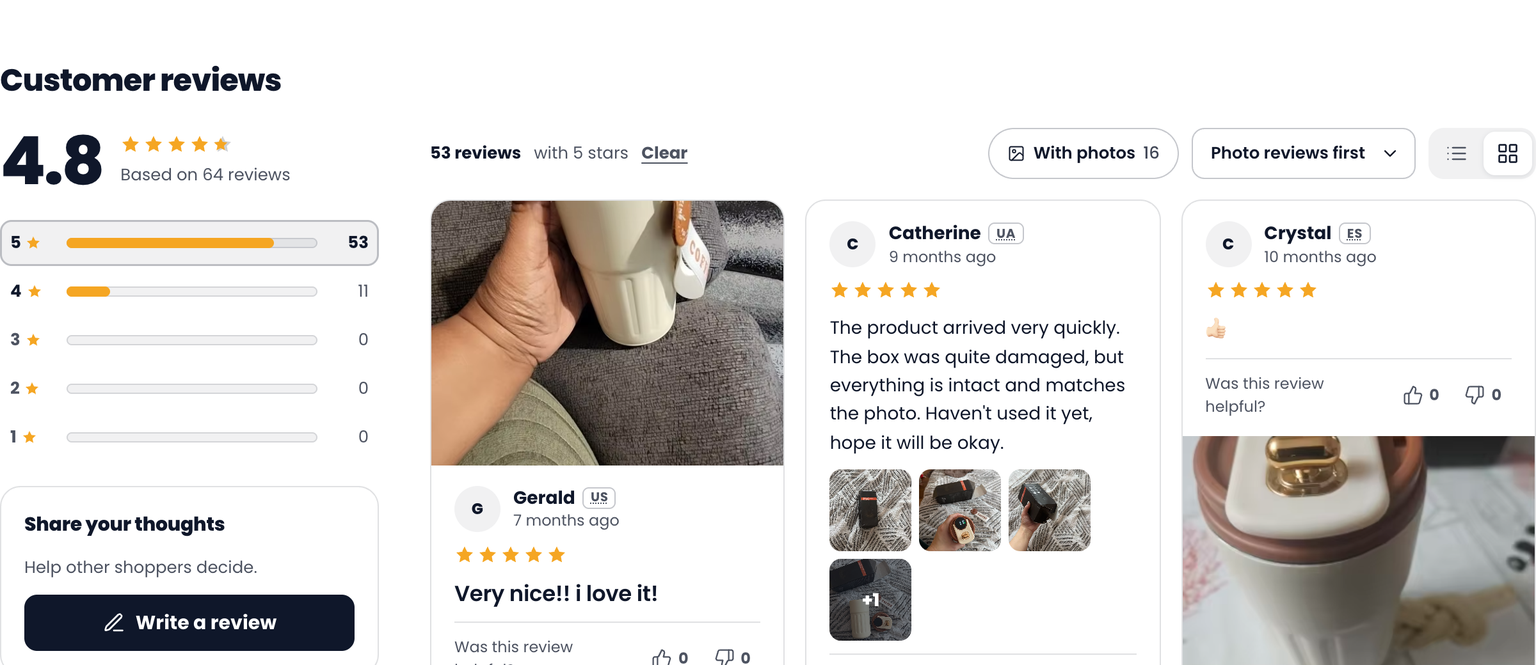
If you turn off Rating filter buttons in Display Settings, the rows still show the numbers but can’t be tapped.
The review bar: photos, sort and layout

Number of reviews on the left.
With photos shows only reviews that have photos, with how many there are. Click it again to show all reviews.
Sort menu: Most recent, Highest rating, Lowest rating and Photo reviews first. It starts on the order you set in Display Settings.
List and grid buttons let shoppers change the layout. It starts on the layout you chose in Display Settings.
With the photos filter on, the button turns dark:

Review cards
Each review is a card with the same parts in the same place, so shoppers can scan them quickly:
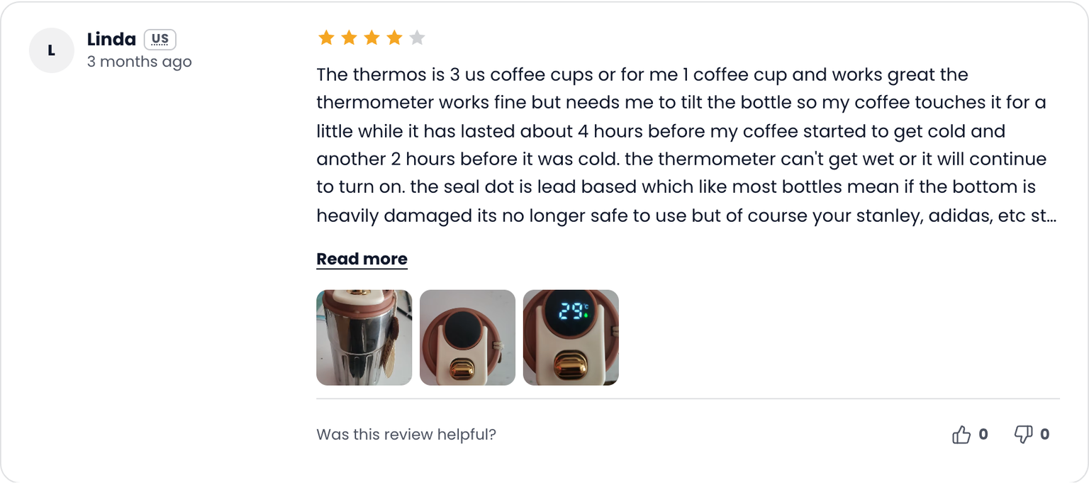
Name and picture. The reviewer’s photo, or their initials when there is no photo.
Country as a short code such as US, when country flags are on in Display Settings.
Verified buyer badge for reviews from verified buyers, and how long ago the review was written, when the date is on.
Stars and review text. Very short reviews show in larger text, so a card never looks empty. Long reviews are cut after a few lines with a Read more link.
Was this review helpful? with thumbs up and down counts.
Photos in review cards
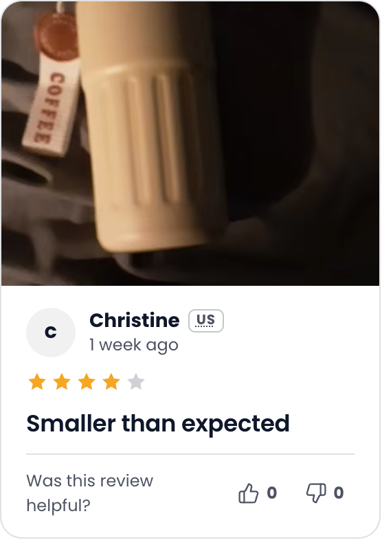
In the grid layout, a review with one photo shows it large at the top or bottom of the card. The position alternates, which keeps the grid varied:
A review with more photos shows small thumbnails. After four, the last thumbnail shows how many more there are, such as +1:
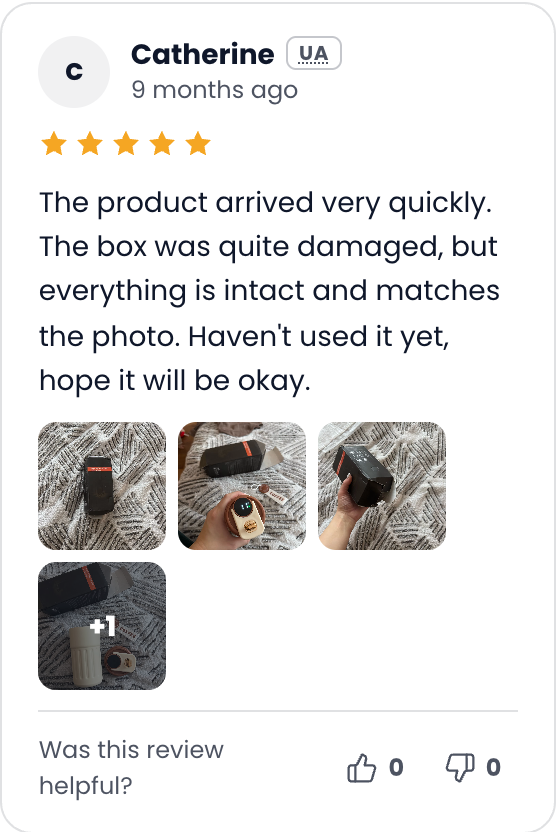
If you turn off review photos in Display Settings, cards show no photos.
List and grid layouts
Grid shows reviews as cards in three columns on a computer and one column on a phone, as in the first picture of this guide. List shows one review per row, with the reviewer on the left and the review on the right:
More reviews
When a product has more reviews than fit on one page, the Modern design shows page numbers or a Show more reviews button, depending on your pagination setting, with how many reviews are shown:

When a product has no reviews yet
Instead of an empty summary with 0.0 and grey bars, products without reviews show a short invitation. Shoppers can tap a star to start their review with that rating already chosen, or click Write a review:
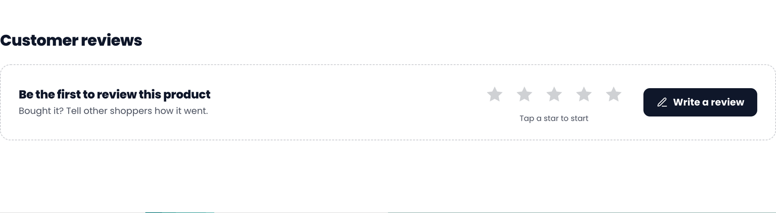
If the Write a Review button is turned off and a product has no reviews, the reviews section is hidden on that product.
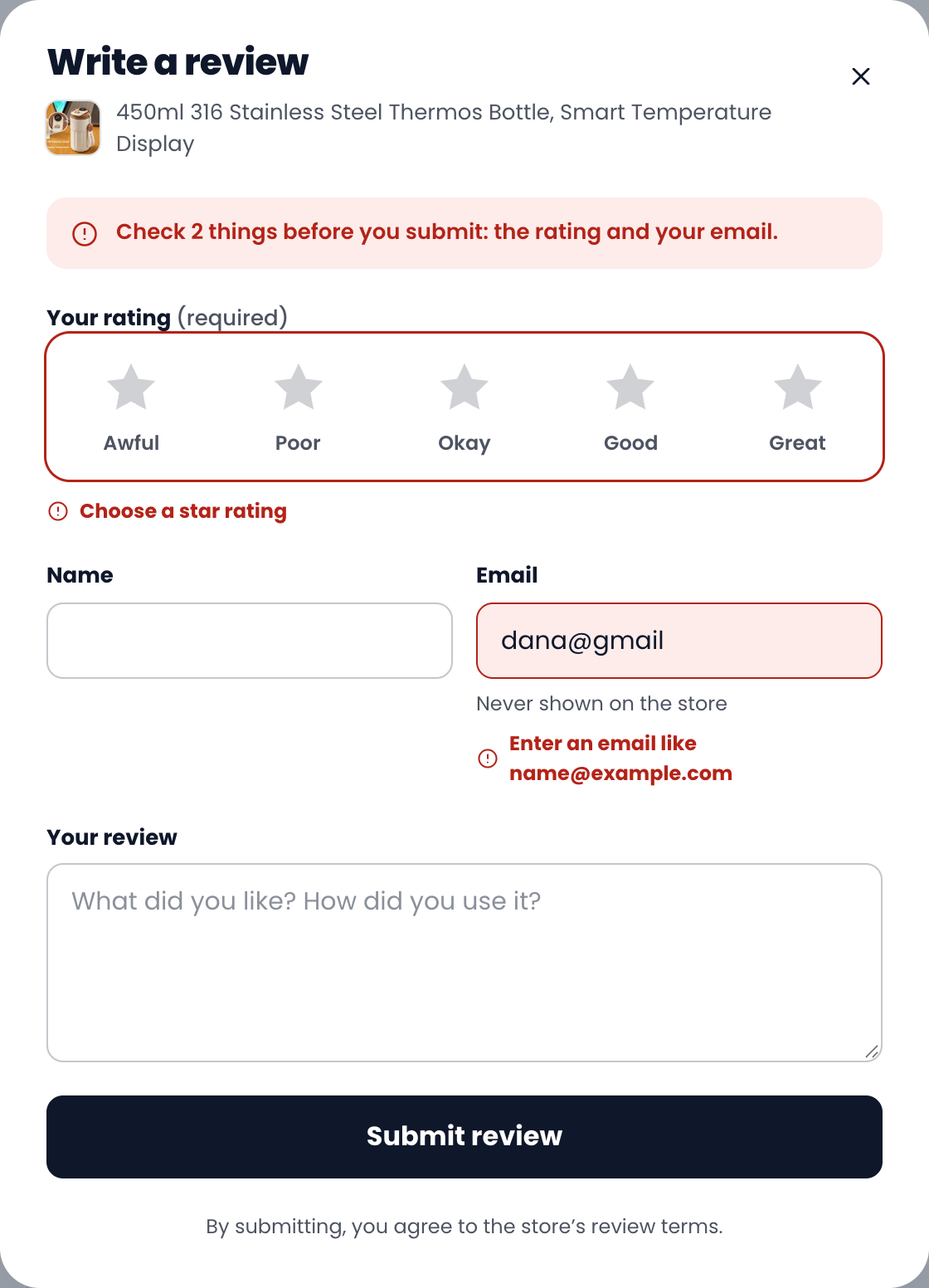
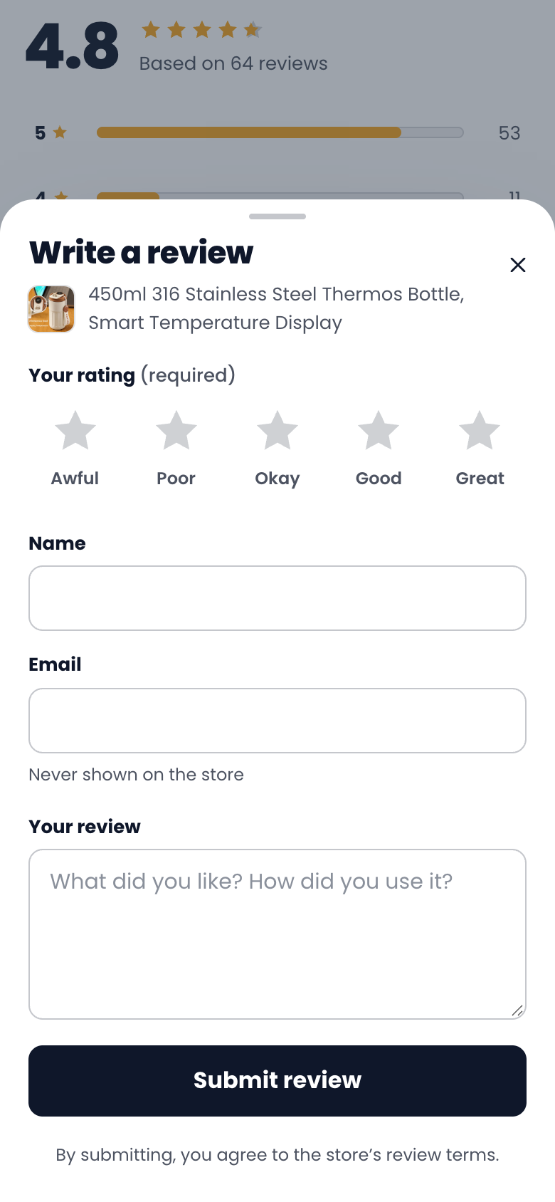
The review form
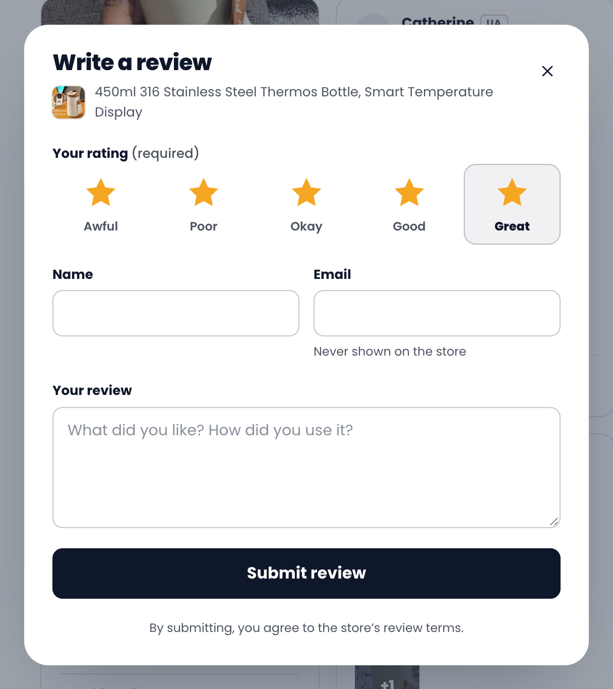
The form opens over the page. It shows the product, then asks for:
Your rating, required. Shoppers pick from five labelled choices: Awful, Poor, Okay, Good and Great.
Name, and Email, which is never shown on your store.
Your review.
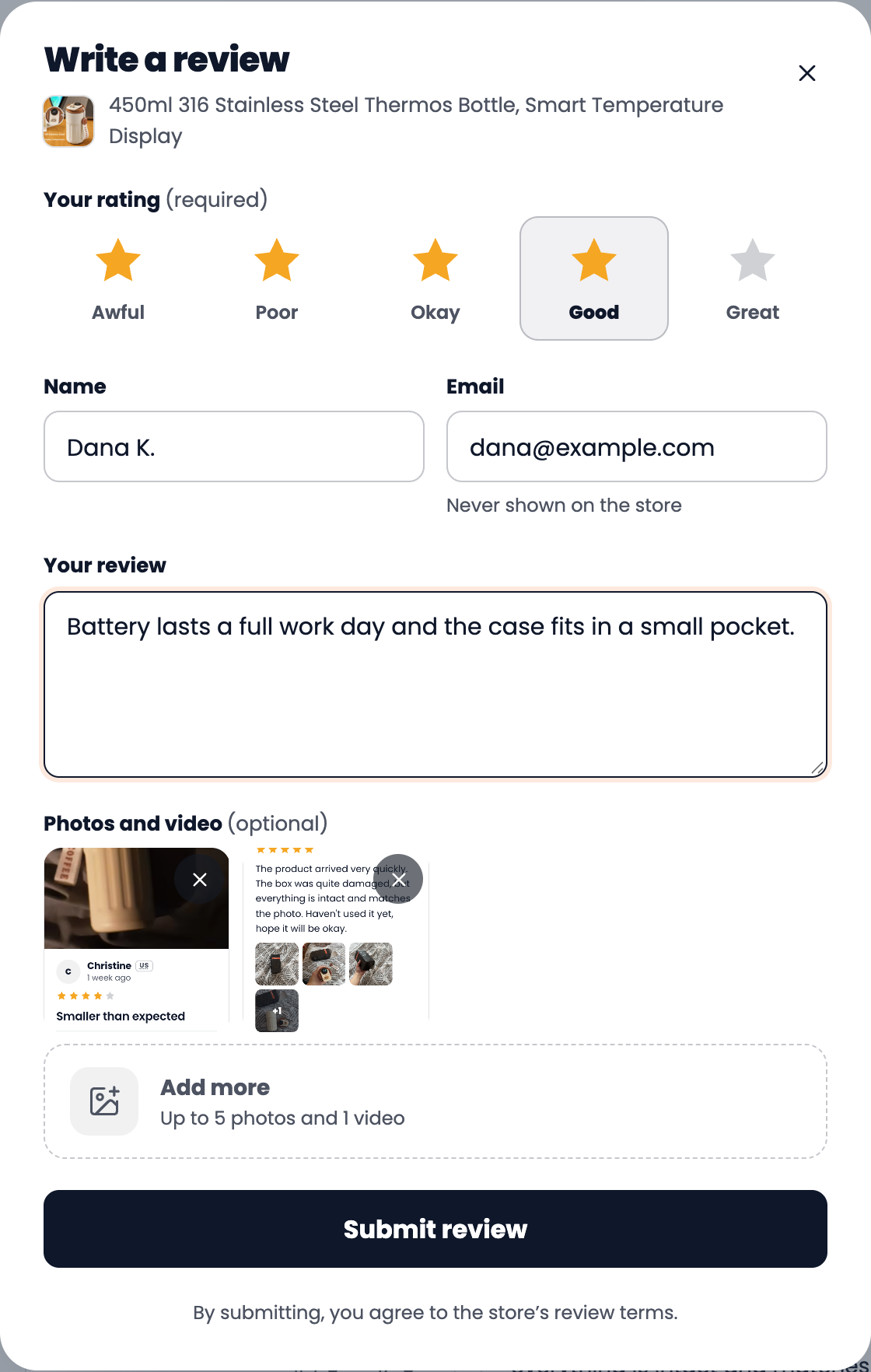
Photos and video, when photo uploads are turned on in Display Settings: up to 5 photos and 1 video.
Clear messages when something is missing
If a shopper submits without a rating, or with an email that isn’t complete, the form says what to fix at the top and next to each field. The messages go away as soon as the field is fixed.
Photos and video
Added photos show as previews in the form. Shoppers can remove one with the cross before they submit:
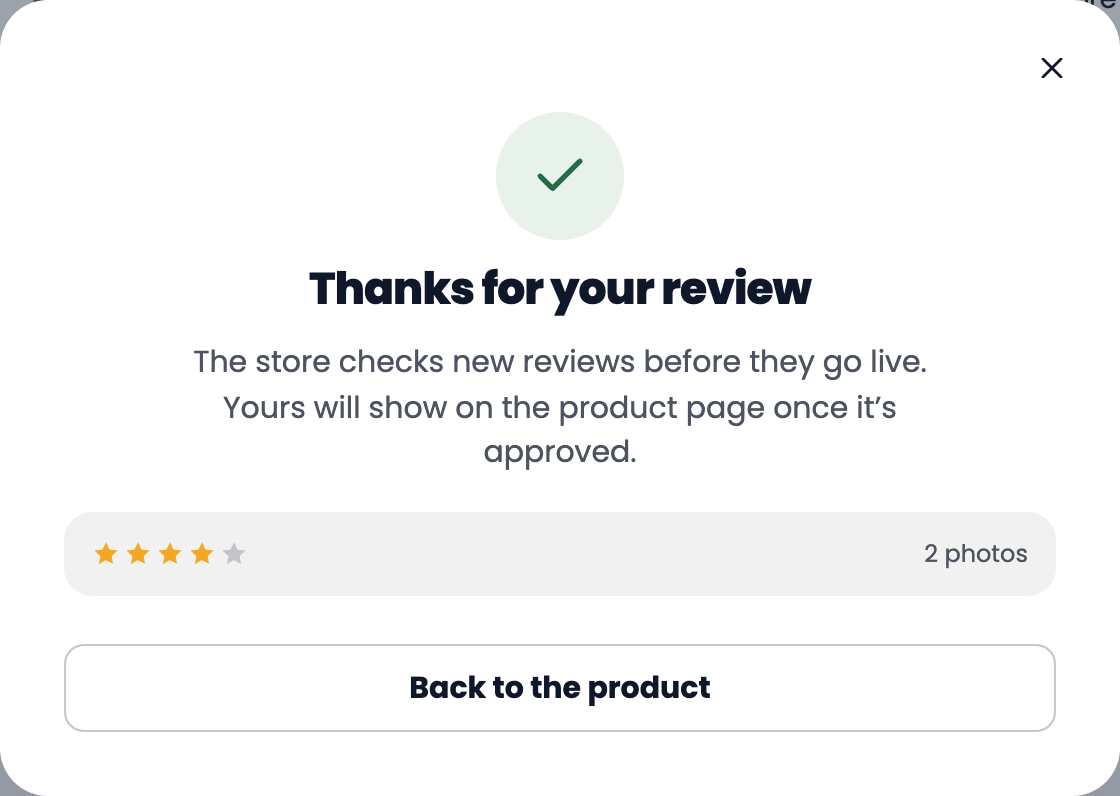
After submitting
The shopper sees a thank-you message that matches your approval setting. If you approve reviews before they go live, it says so:
If reviews are published automatically, it says the review is live, and the reviews on the page refresh when the shopper closes the message:
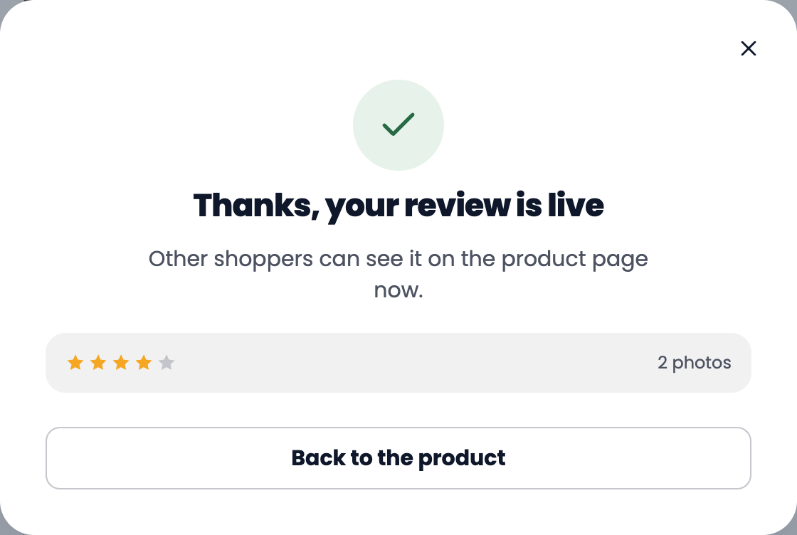
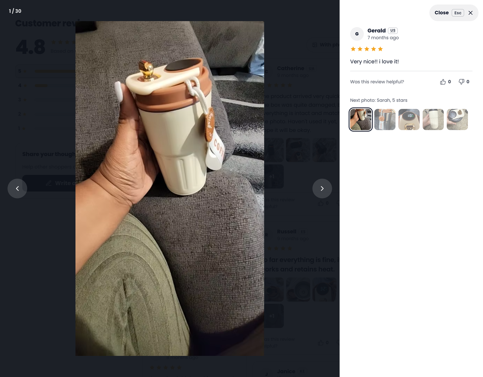
Photo viewer
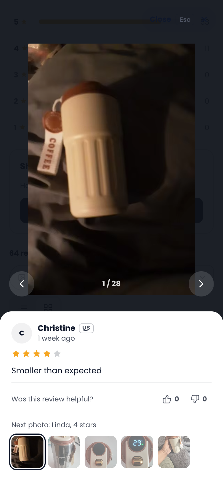
Clicking any review photo opens the photo viewer. The photo shows large on the left and the review it belongs to on the right, with its stars, text and helpful votes. Shoppers move through all the review photos with the arrows, the arrow keys or the thumbnails, and close it with the Close button or Esc.
On mobile
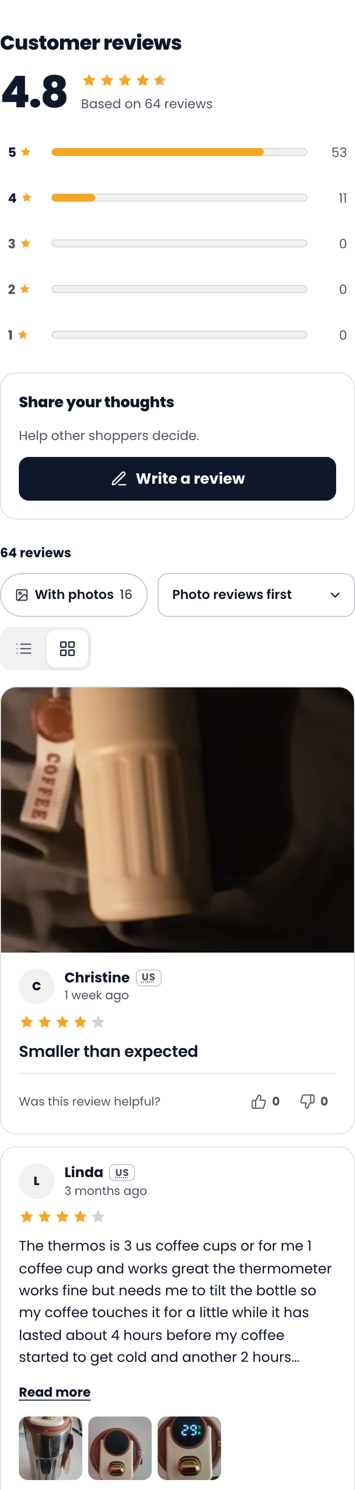
On a phone the summary, the bar and the cards stack in one column, and buttons are large enough to tap. The review form opens as a sheet from the bottom of the screen, and the photo viewer shows the review under the photo:
Your settings carry over
The Modern design uses the settings you already have in Display Settings:
star colour, text colour and background colour
font, or your theme’s font
list or grid layout and the default sort order
showing the date, country, review photos, the rating filter and the Write a review button
the widget language, right-to-left languages, and your custom texts
FAQ
Which platforms have the Modern design?
Shopify, WooCommerce, Wix and BigCommerce.
What does the Modern design change?
The reviews section on your product pages: the summary, filters, review cards, the review form and the photo viewer. The stars under the product title, the stars on collection pages, the homepage testimonials and the all reviews page keep their current look for now.
Will switching delete or change my reviews?
No. Only the design changes. Your reviews, ratings, photos and settings stay the same, and you can switch back to Classic at any time.
I switched but still see the old design
Refresh the product page. If your store uses a cache or a speed app, clear its cache. On Shopify, check that the Editorify app embed is turned on in your theme. See how to turn review widgets on or off.
Related guides
Still stuck? Contact support or email support@editorify.com.